Project Overview

Epic Planner is a modern wedding planning platform created during a UX/UI boot camp as a collaborative project.
The product includes a responsive website and mobile app designed to offer a seamless, intuitive experience for couples planning their weddings.
It connects users with a broad range of event vendors, while giving vendors space to showcase their services and attract clients.
The problem
Couples often struggle with managing wedding planning across multiple platforms, leading to disorganization and added stress.
There’s a lack of centralized platforms that offer clear vendor information, including pricing, availability, portfolios, and reviews.
Many users feel overwhelmed without proper tracking tools and reminders to help stay on schedule.
The goal
Create a user-friendly interface that allows couples to easily browse, compare, and book wedding vendors in one place.
Design a mobile app with built-in tracking and reminders to help users manage their wedding planning anytime, anywhere.
Support a smooth booking experience focused on a key task: finding and booking a wedding photographer, with access to portfolios, pricing, availability, and customer reviews.
Deliver a stress-free, efficient experience by bridging the gap between couples and vendors.
Design Process
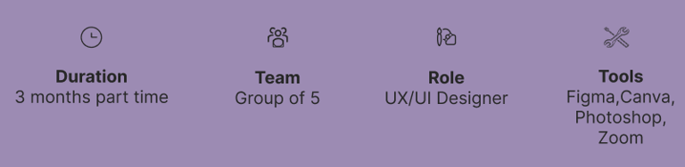
Our team of five utilized the Double Diamond framework, based on the Design Thinking methodology, to shape our process. Instead of adhering to a strictly linear approach, we moved through stages iteratively, continuously refining our solutions as the project progressed.
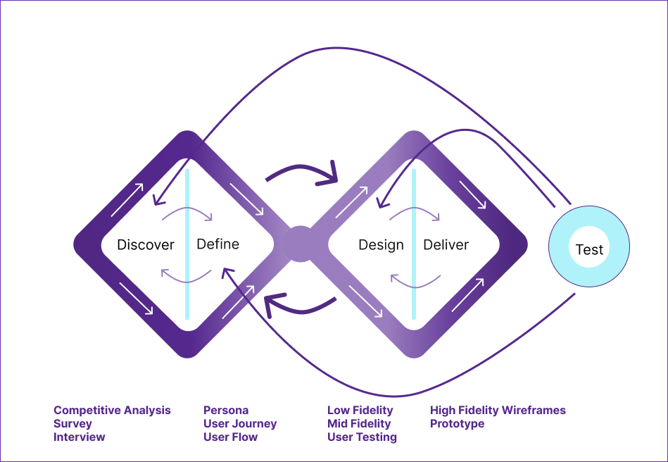
Discover
Research was conducted in two phases:
Phase 1: Competitive Analysis
Phase 2: Surveys and Interviews
Competitive Analysis
The team analyzed the strengths and weaknesses of various applications offering similar services to our platform.
The Knot
This wedding planning application was included in our competitive analysis, and the findings are summarized below.
Zola
Zola, another wedding planning application, was part of our competitive analysis. The results are presented below.
Survey
Our team conducted a survey to understand user challenges and preferences when booking wedding services online. The insights gathered from this research were instrumental in refining our design and enhancing the overall user experience.
Interview
To better understand user behavior, we conducted interviews with five individuals from different age groups, all of whom were in the process of planning a wedding and selecting a photographer. This diversity allowed us to capture a range of perspectives and priorities when making such an important decision.
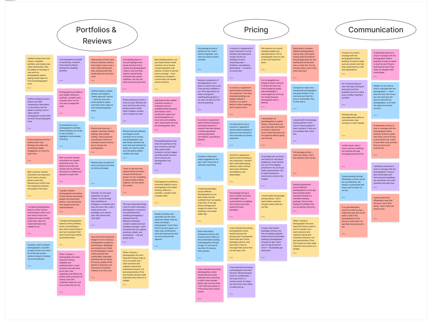
Survey and interview takeaways
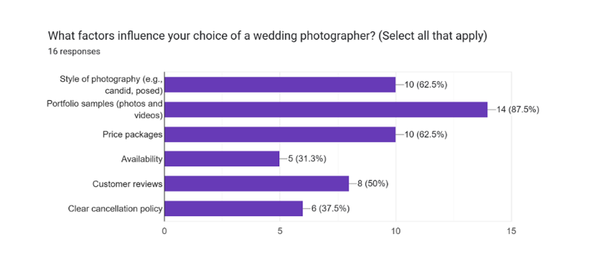
Portfolios & Reviews: The first element people look at is the photographer’s portfolio and feedback from past clients. Strong visuals and positive reviews build trust and credibility.
Pricing: After assessing quality, users compare prices to ensure services fit their budget. Transparent and easy-to-understand pricing plays a critical role in decision-making.
Communication: Finally, users value how easily they can connect with the photographer. Clear and accessible communication helps them feel confident about booking.
Define
In this phase, the goal was to make sense of the research findings and translate them into a clear direction for design. By analyzing user interviews and observations, I refined raw data into insights that could guide decisions throughout the project.
Synthesized key insights gathered during the discovery phase to define the core user problem
Organized research findings into actionable design goals
Identified patterns in user behavior, pain points, and motivations
Framed a clear problem statement to guide design decisions
Established a shared understanding of user needs across the team
Set the foundation for creating a user persona that informed all future design phases
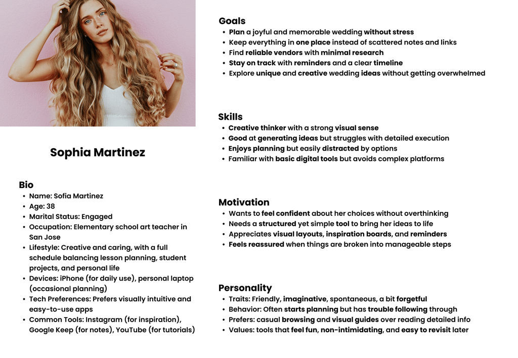
Persona
The following persona captures our primary user and helped shape our design strategy.
Design
We translated user needs into solutions through iterative prototyping. Starting with low-fidelity wireframes, we explored layout and user flow. Mid-fidelity wireframes refined functionality and navigation, allowing for usability testing. Finally, high-fidelity mockups captured the final UI with brand elements and realistic content, ensuring a user-centered, goal-aligned design.
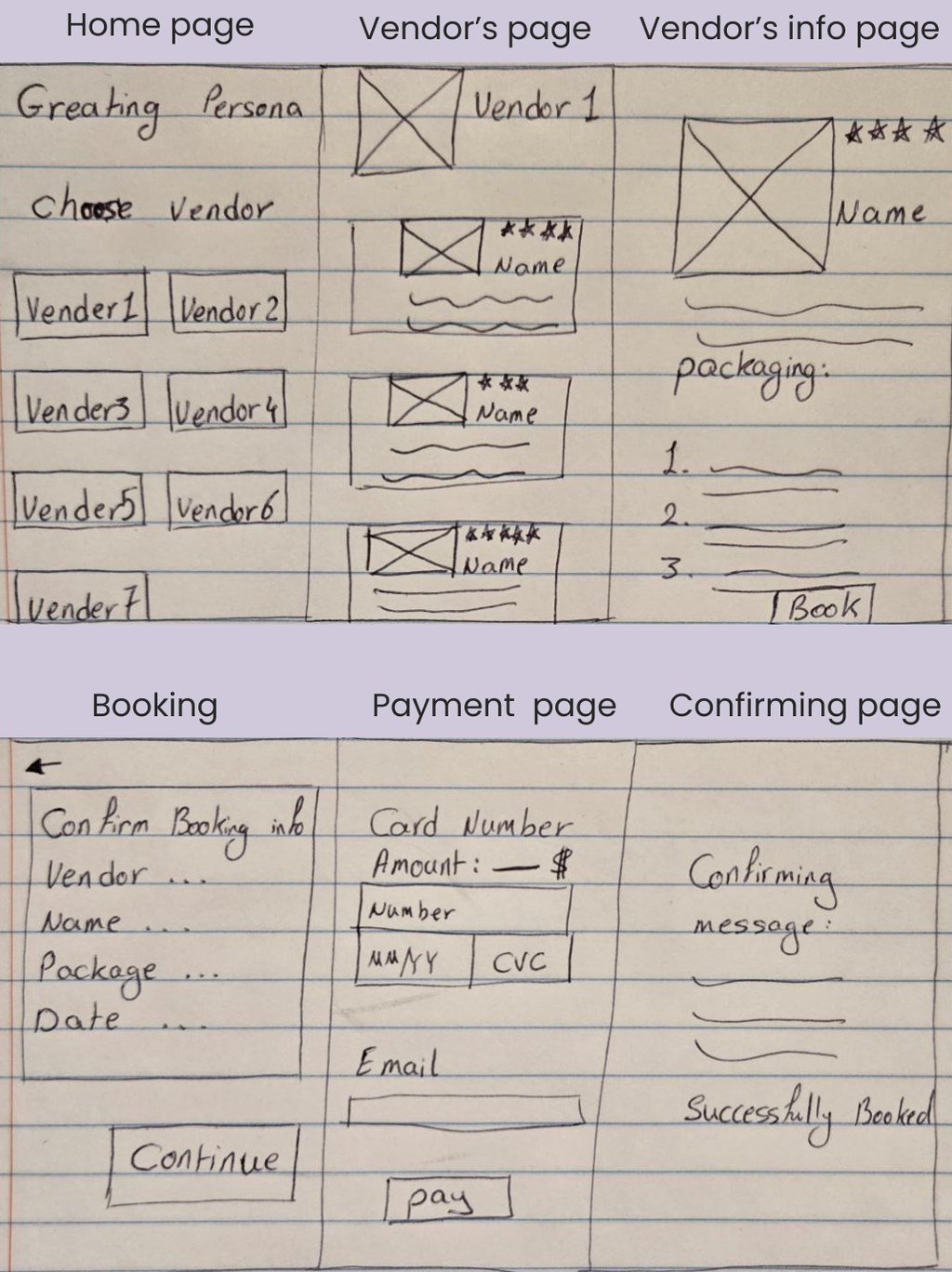
Low Fidelity
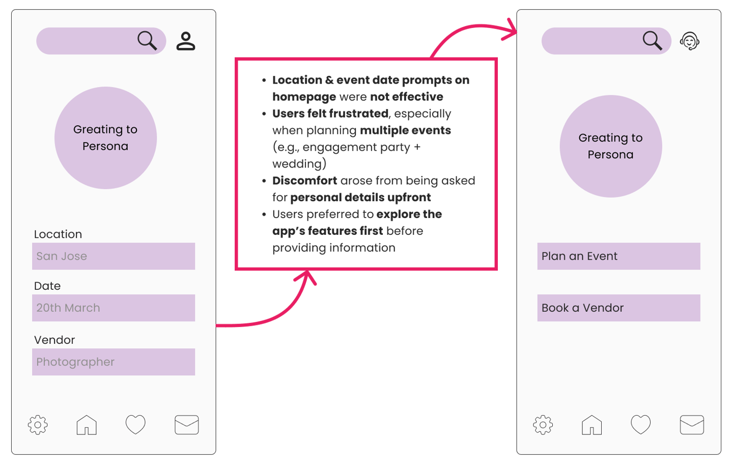
As part of the Design Phase, we created a low-fidelity sketch to help the team visualize the user journey of booking a photographer. This early prototype allowed us to track the task within the app and explore effective ways to implement the key decision-making factors users highlighted—such as portfolio quality, pricing transparency, availability, and reviews.
Deliver
Mid Fidelity Usability testing
Next, we created a mid-fidelity wireframe to test the design's layout, navigation flow, and core functionalities early in the process. This step helped validate structural decisions and allowed for refining the visual hierarchy, user interactions, and navigation patterns. Usability testing at this stage provided valuable feedback before moving on to high-fidelity visuals and final styling.
High Fidelity Usability Testing
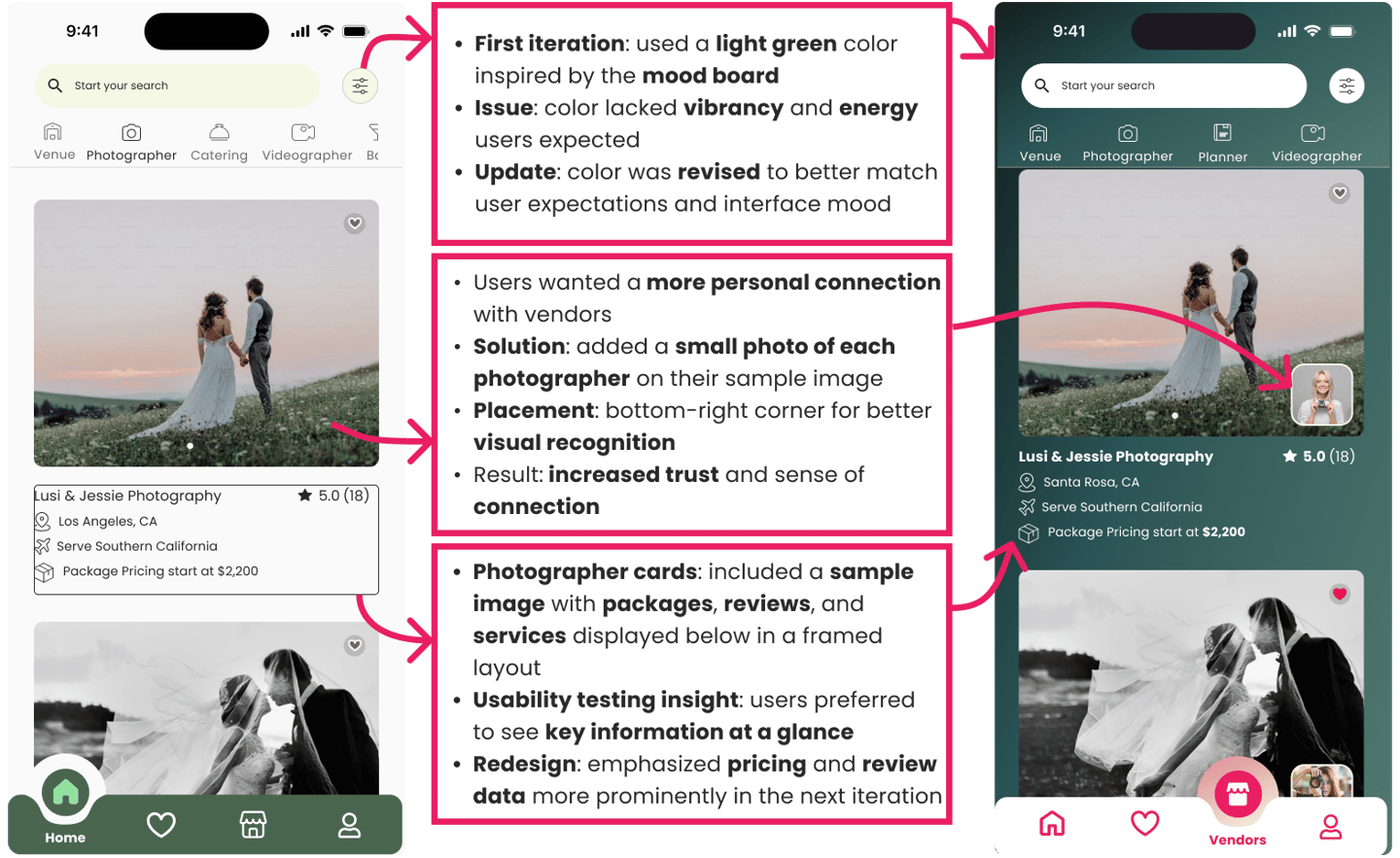
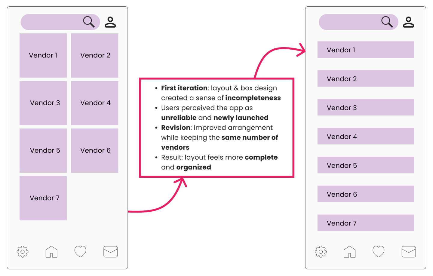
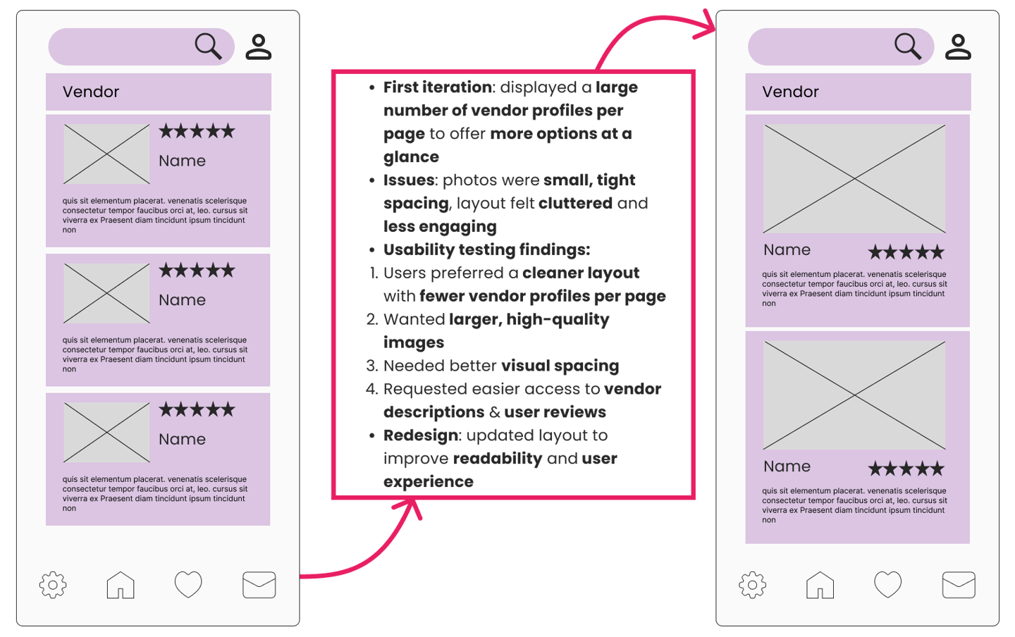
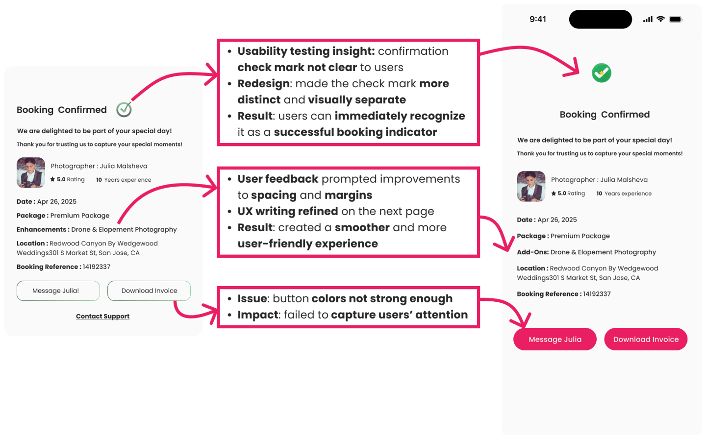
Conducting usability testing on the high-fidelity prototypes was a turning point in the design process, revealing valuable insights that shaped the final product.
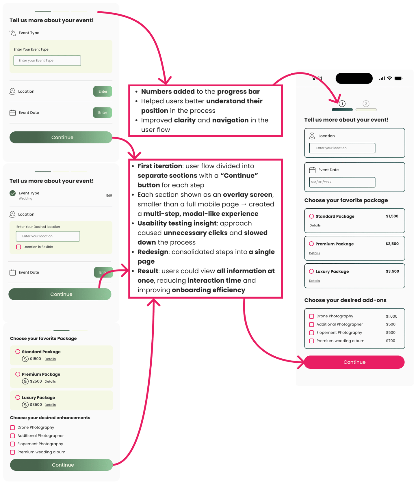
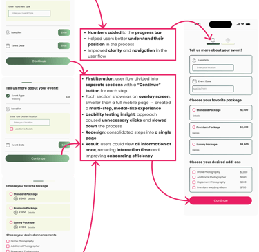
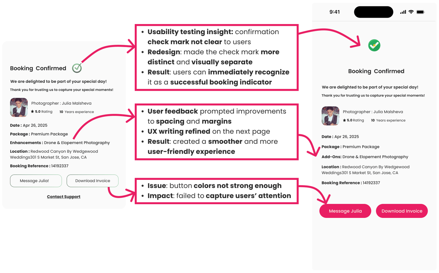
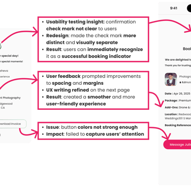
Identified issues such as button visibility and a confusing confirmation check mark.
Found that multi-step overlays slowed users down and disrupted the flow.
Learned that the chosen color palette did not resonate with users as expected.
Made substantial updates to colors, layouts, and interaction patterns.
Refined hover states, payment flows, and overall navigation.
Strengthened the design to feel clearer, more trustworthy, and efficient.
These refinements ensured the design truly aligned with user expectations, transforming the prototype into a product that delivers a seamless and engaging experience.
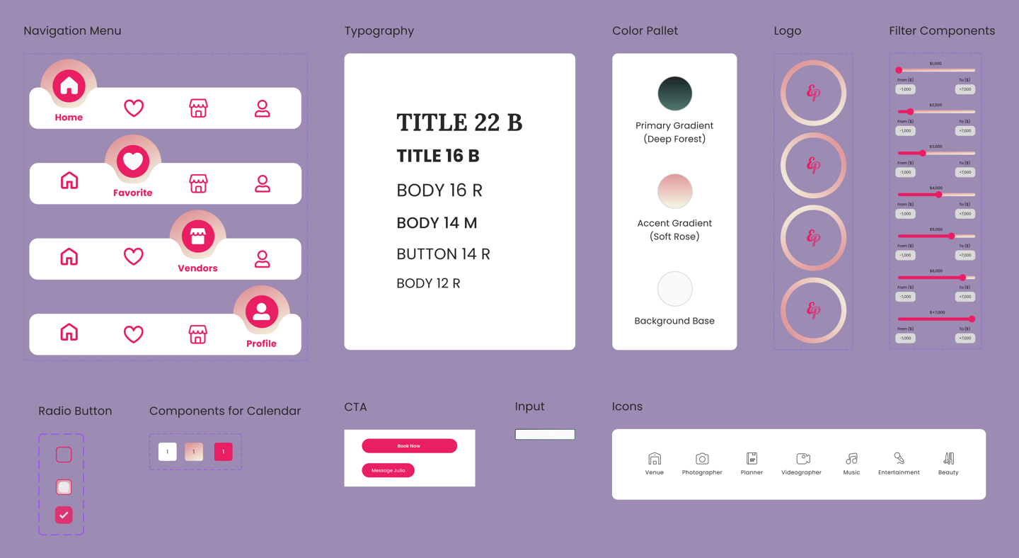
UI Kit
These insights were then refined into a UI kit, ensuring consistency across typography, color palette, and interface components.

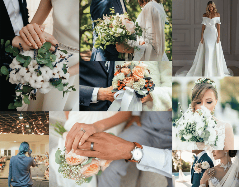
Mood Board
To establish the visual direction, I created a mood board that captured the brand’s tone and user expectations.
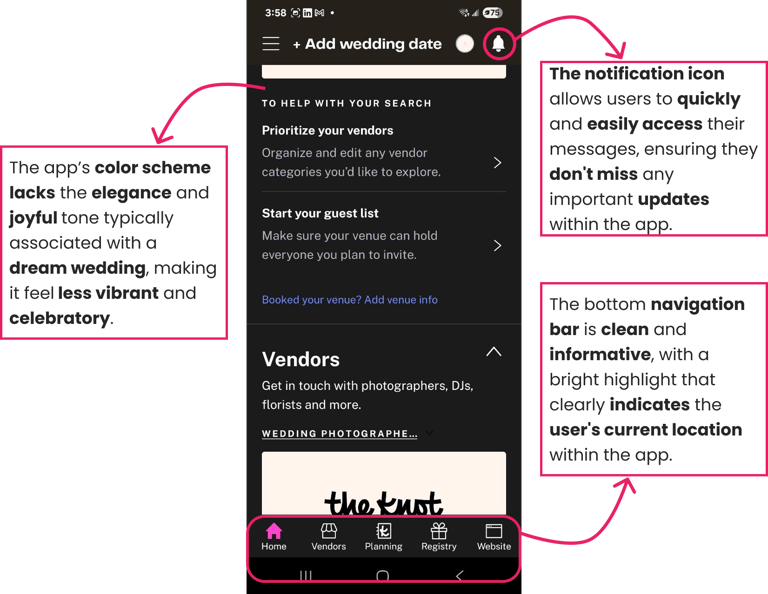
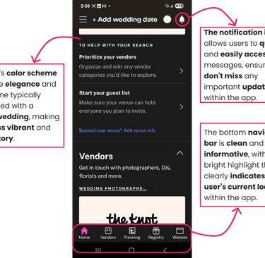
High Fidelity
Finally, we created high-fidelity mockups that reflect the final look and feel of the product. These included detailed UI elements, brand colors, typography, and realistic content to simulate the actual user experience. This progression ensured that our design decisions were informed, user-centered, and strategically aligned with the project goals.

Splash Screen
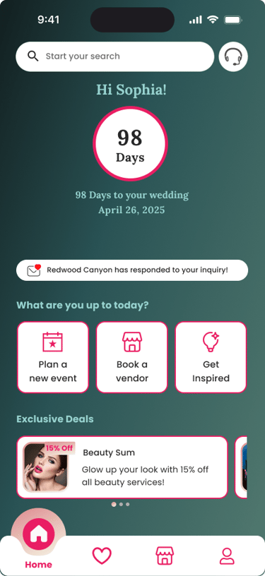
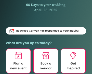
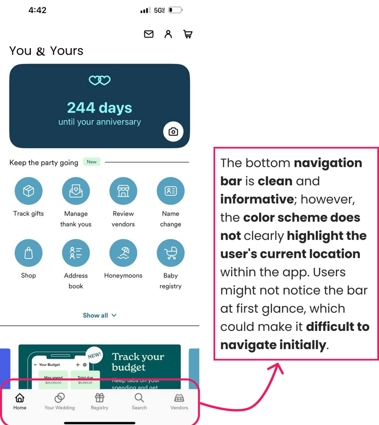
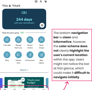
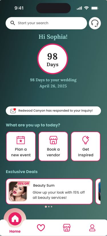
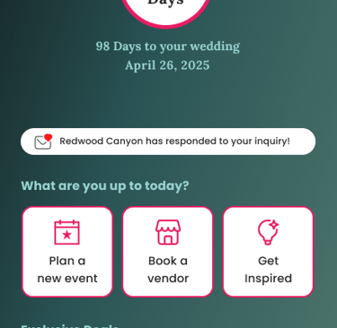
Home page
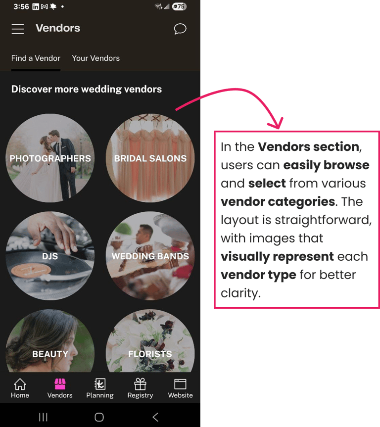
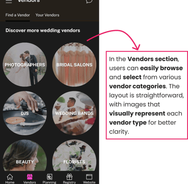
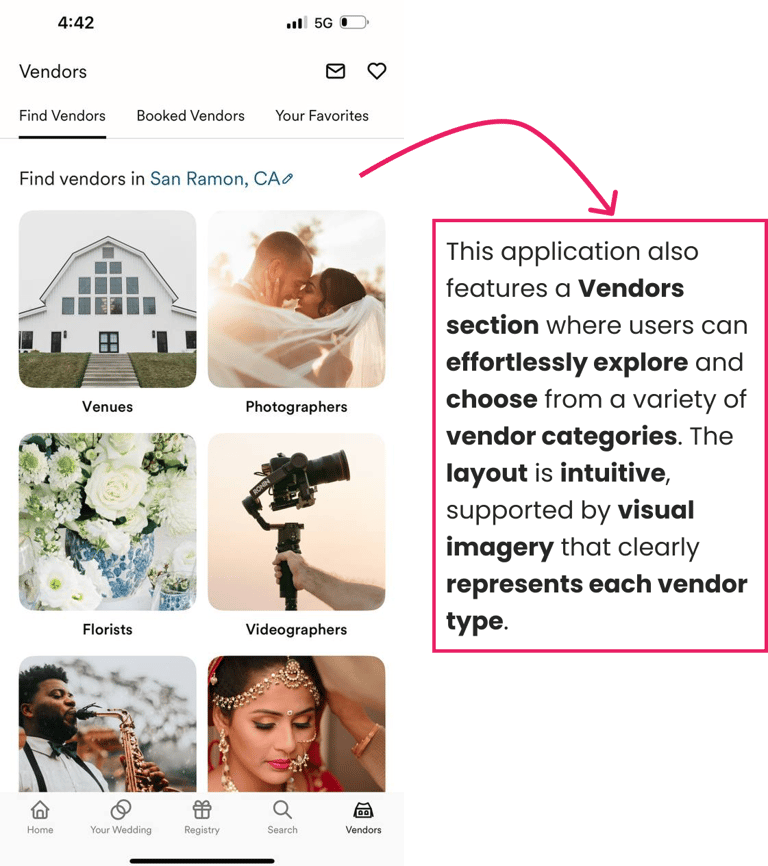
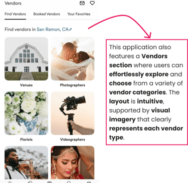
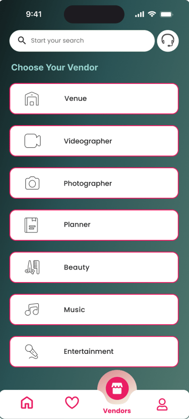
Venders' page
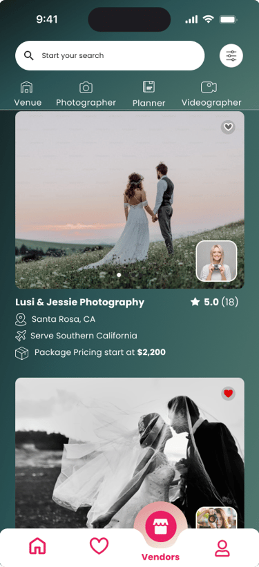
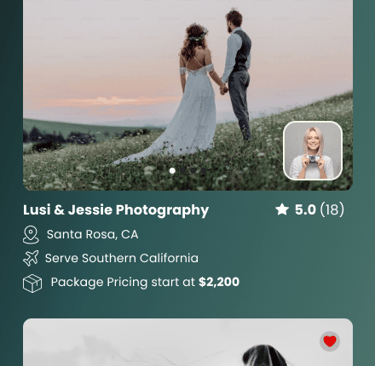
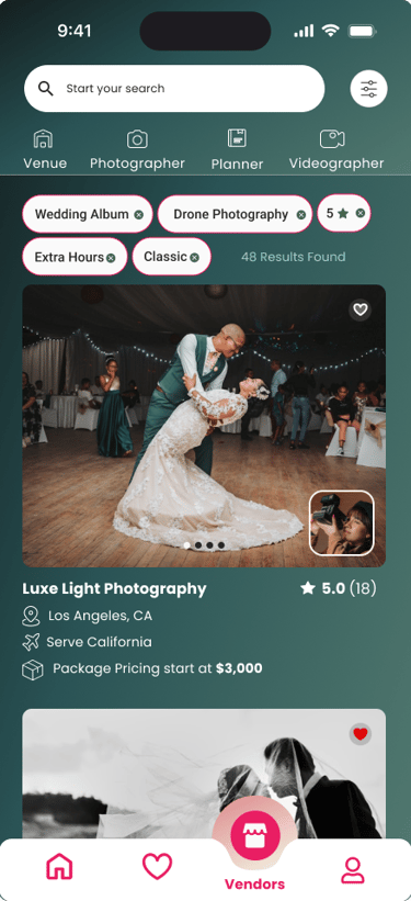
Photographers page before filter
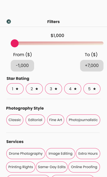
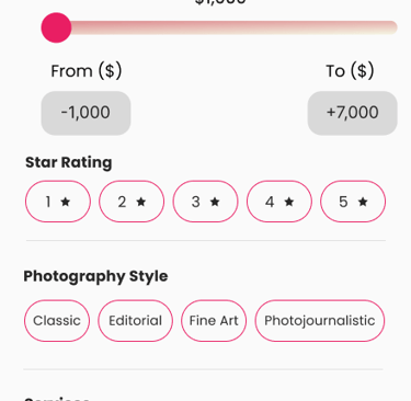
Filters Page
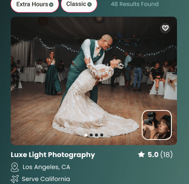
Photographers page after filter
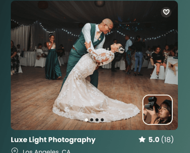
Selected Photographer's page
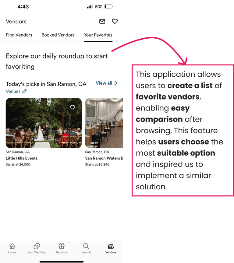
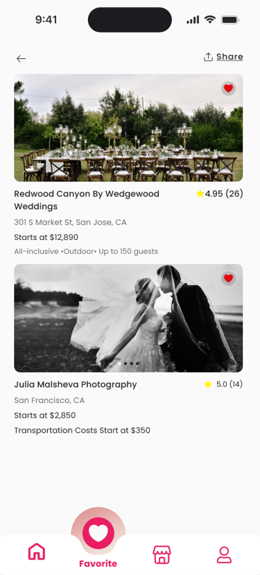
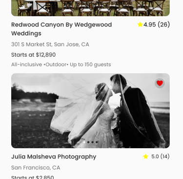
Favorite Page
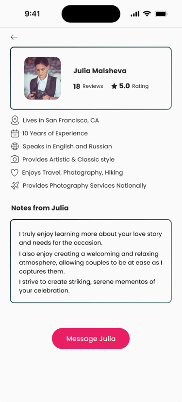
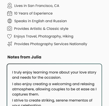
About Photographer's page
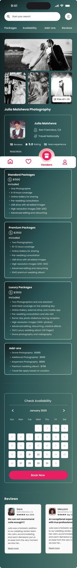
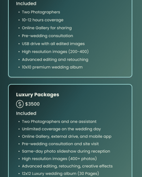
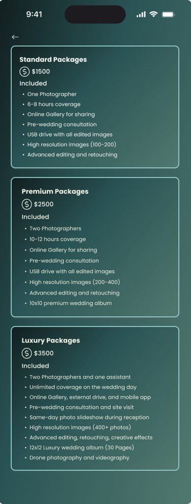
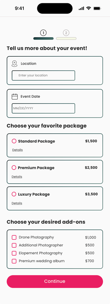
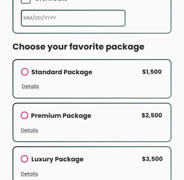
Photographer's Package page
Check out step 1
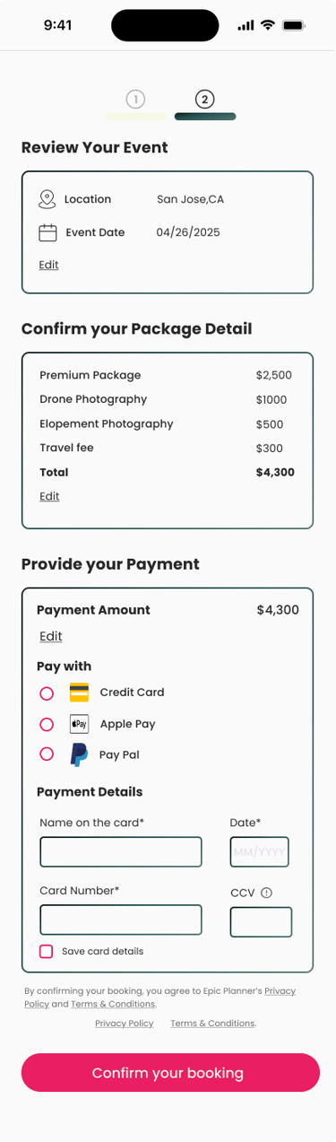
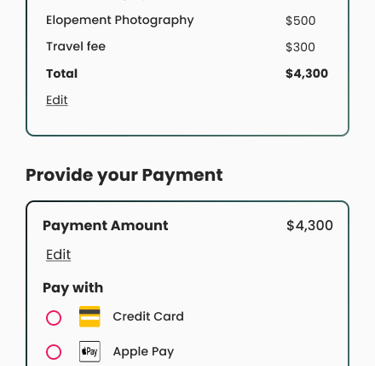
Check out step 2
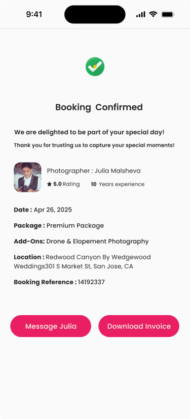
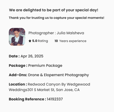
Check out step 3
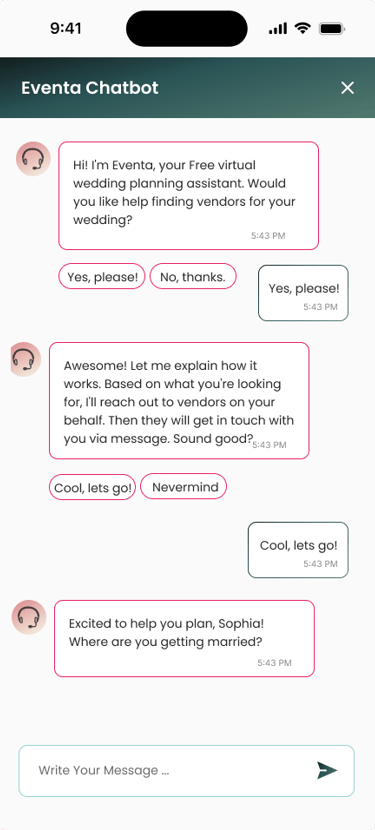
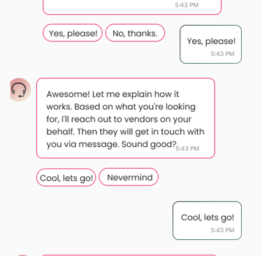
Chatbot page
Reflection
Learned the importance of staying user-centered throughout the process
Interviews and usability testing revealed that portfolios, reviews, and pricing were the most important decision factors for users
Early assumptions about layout and color choices did not fully meet user needs, which testing helped uncover
Staying open to change was key—dramatic updates to color palette, layout, and information hierarchy improved clarity and trust
Realized that creativity is not just about new ideas, but also about being flexible and adaptable when feedback suggests a different direction
The project reinforced that iteration, feedback, and adaptability lead to designs that are both visually engaging and practical for users
Takeaway: Designing for users is a continuous learning process, and embracing change leads to stronger, more meaningful solutions